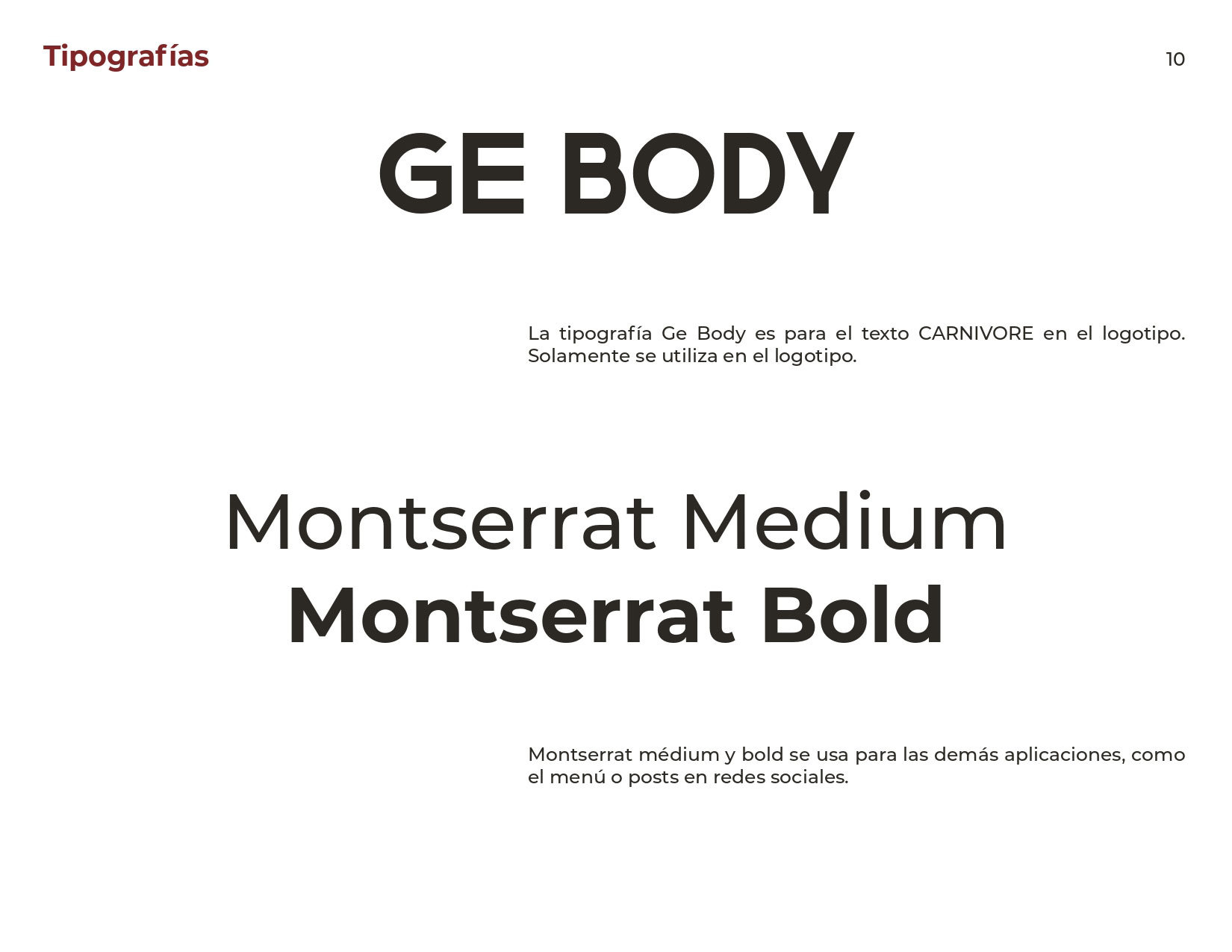
complete brand identity
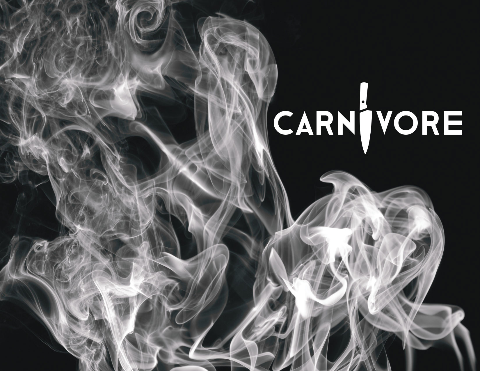
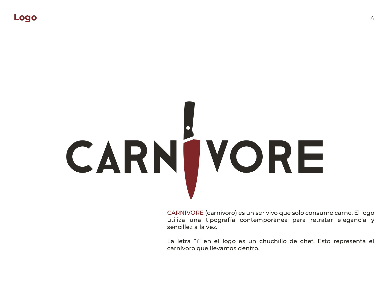
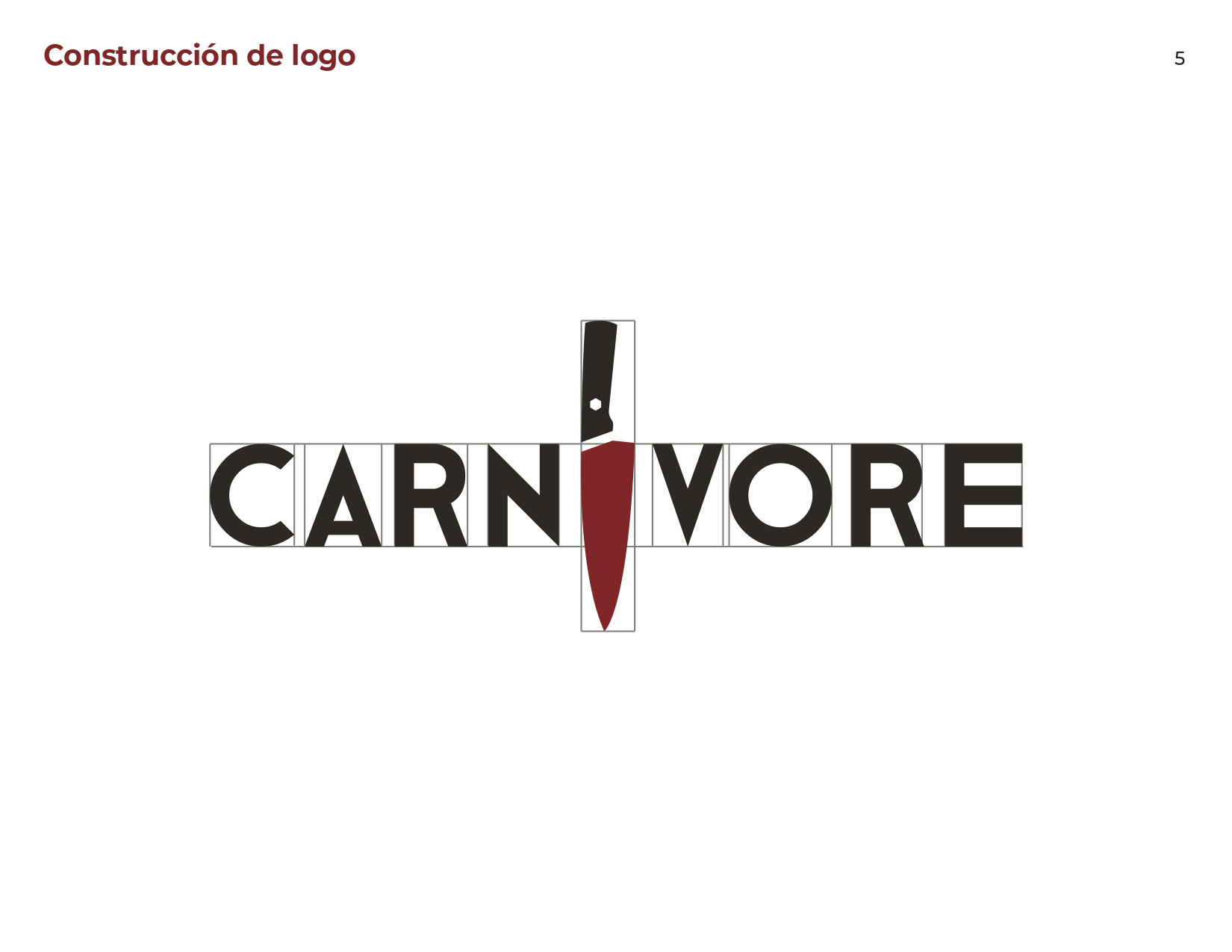
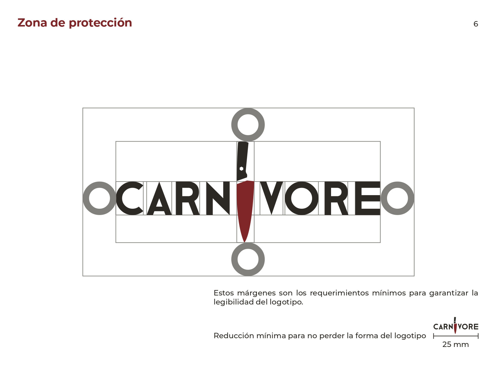
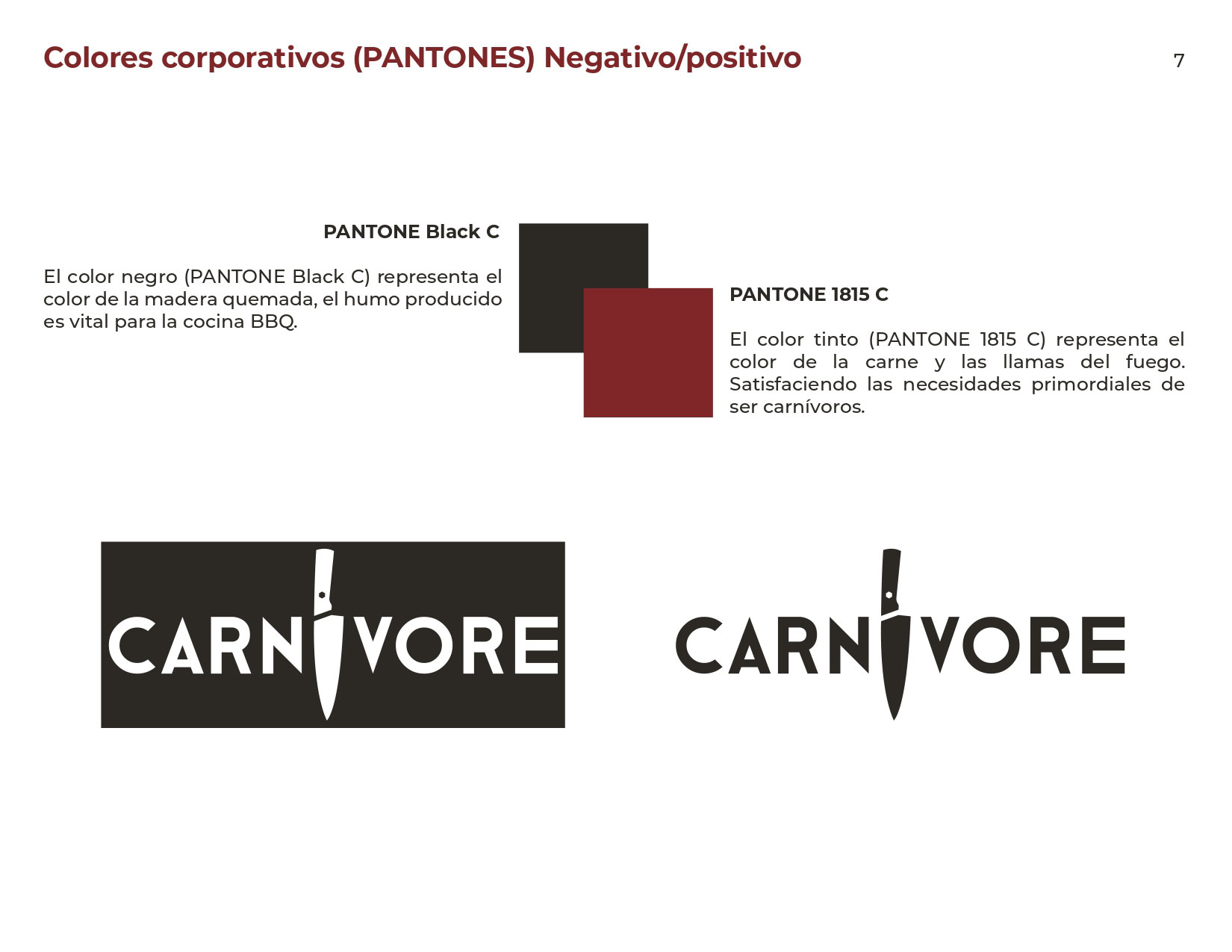
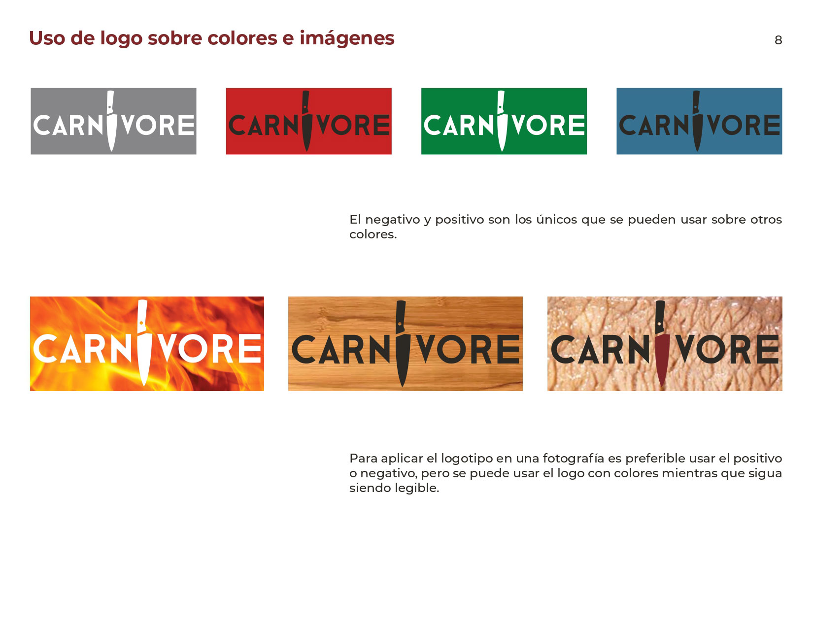
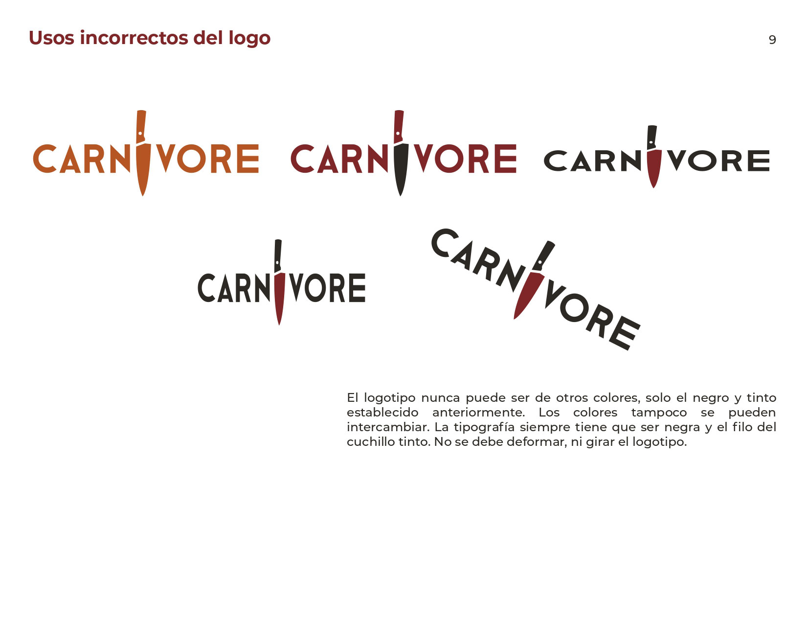
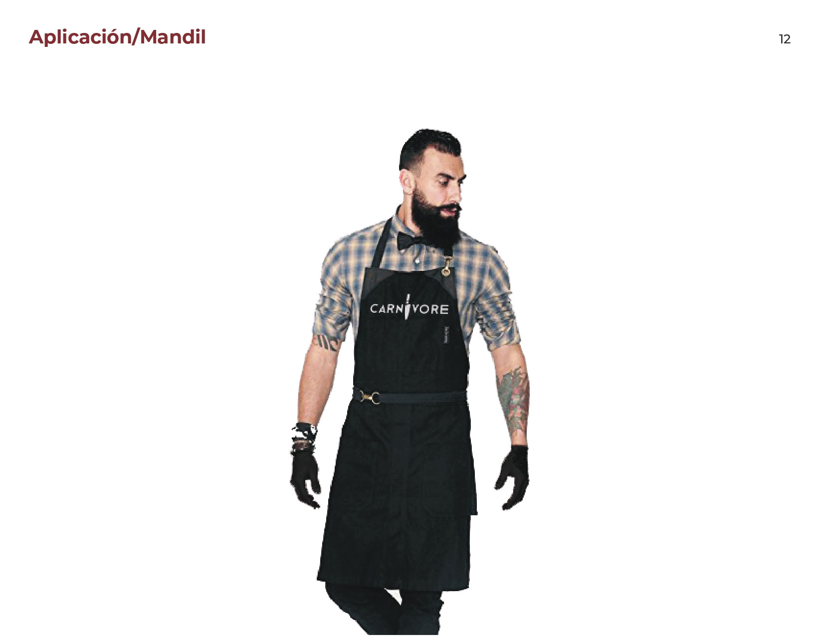
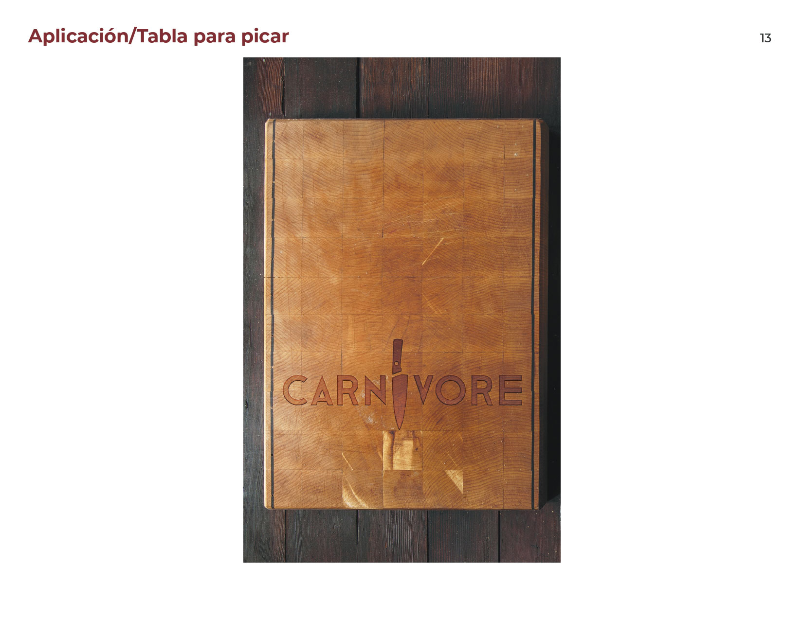
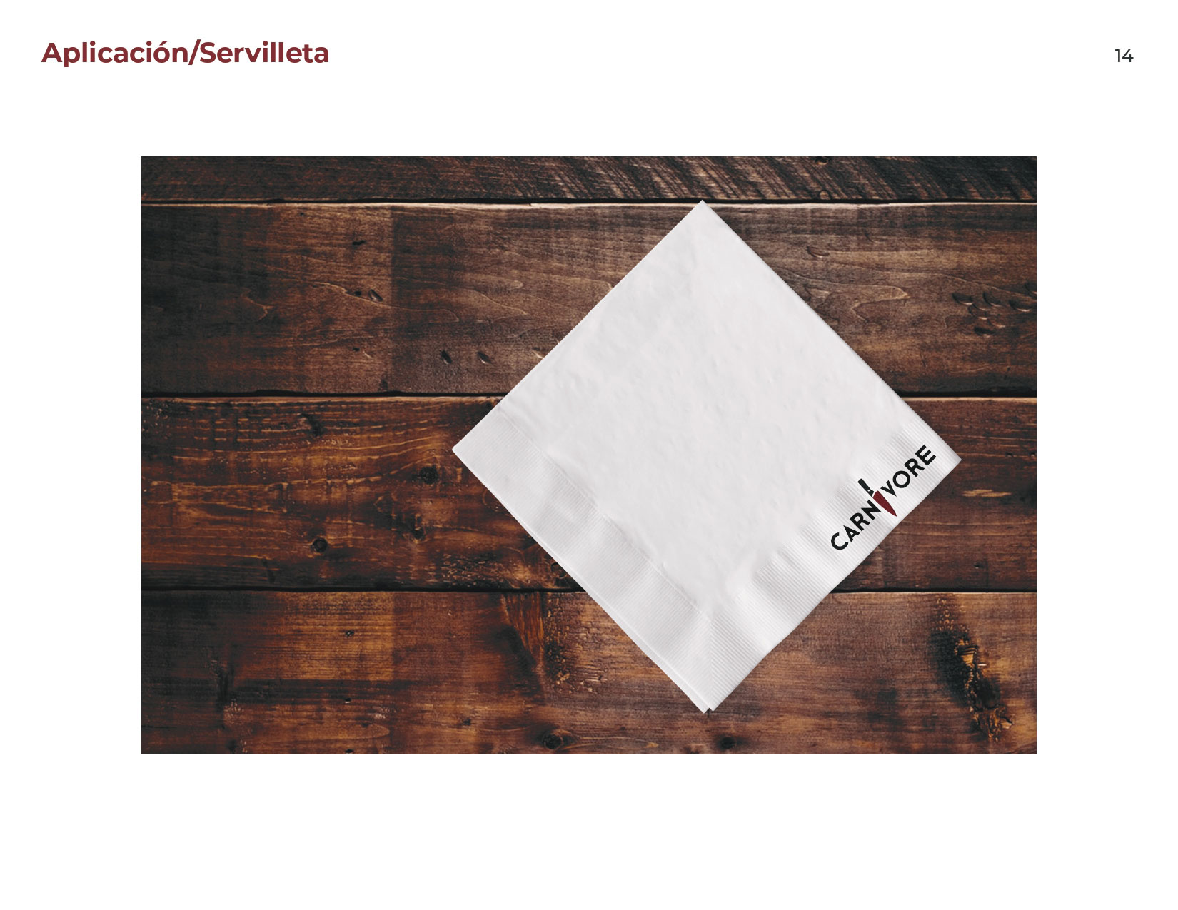
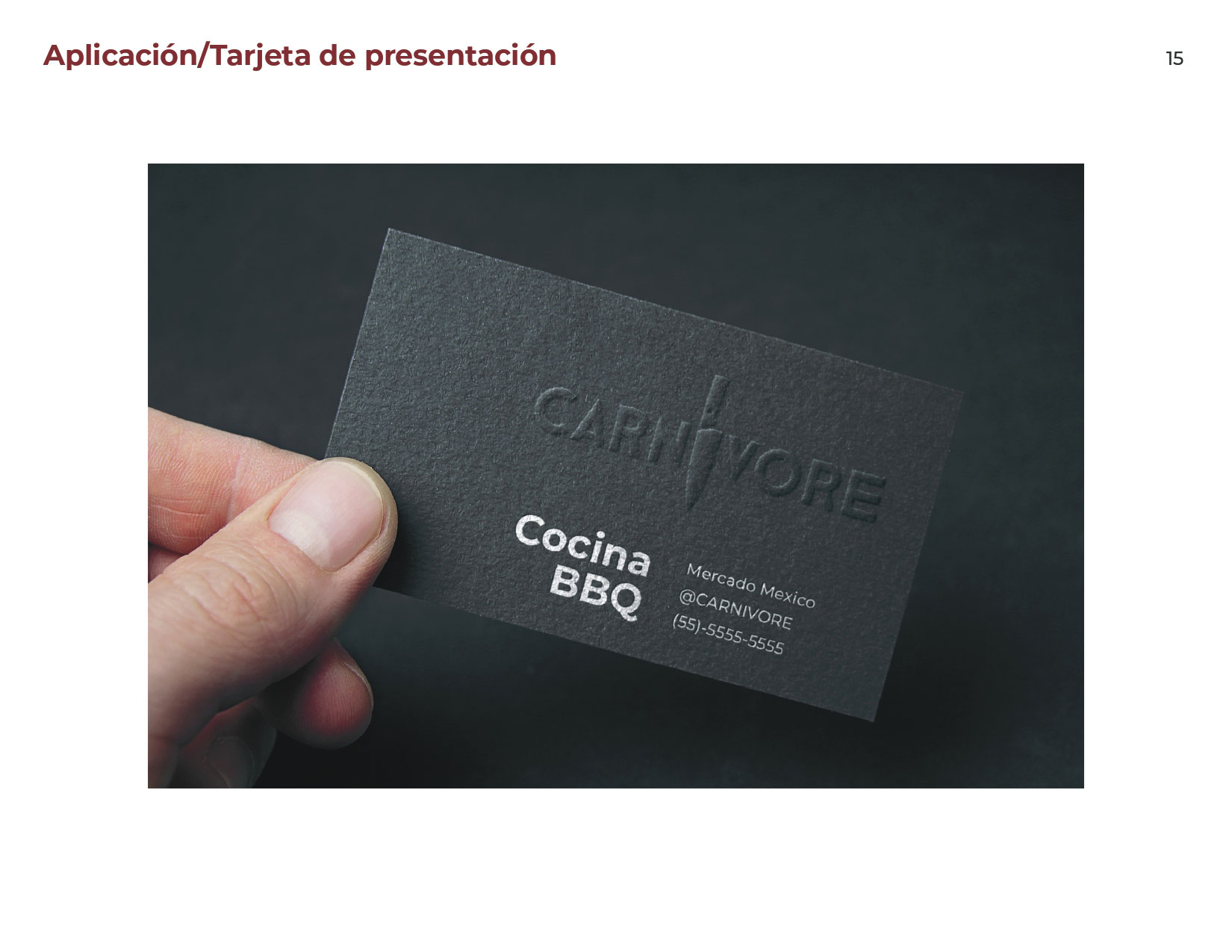
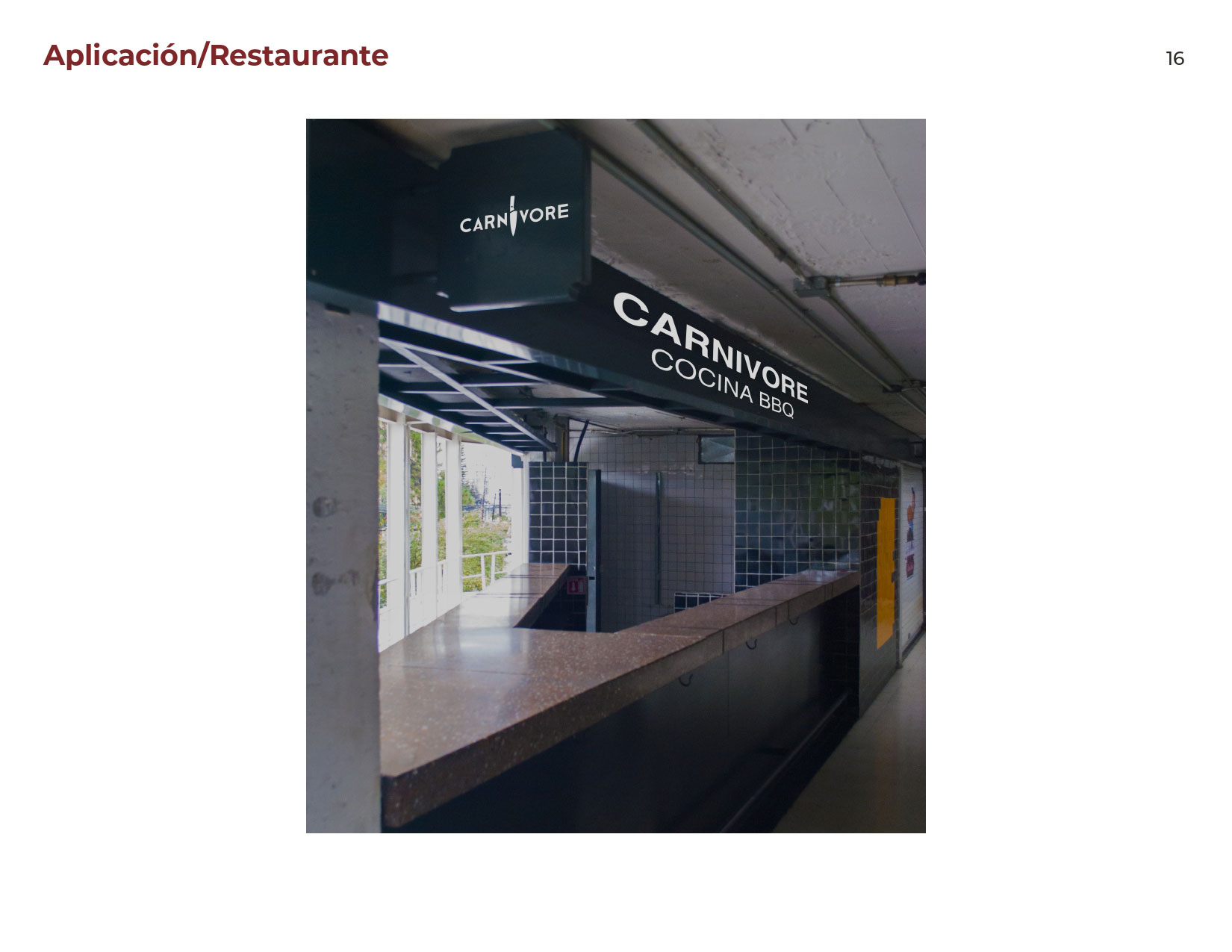
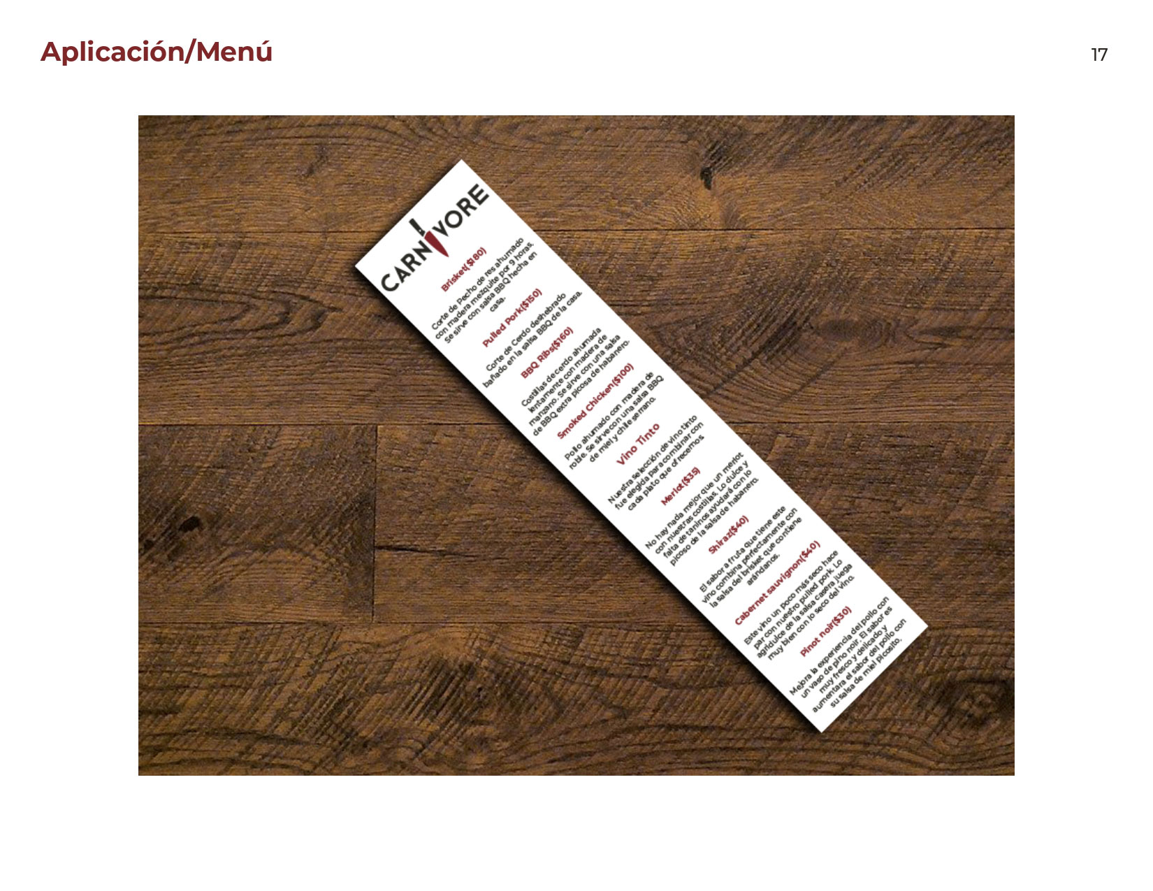
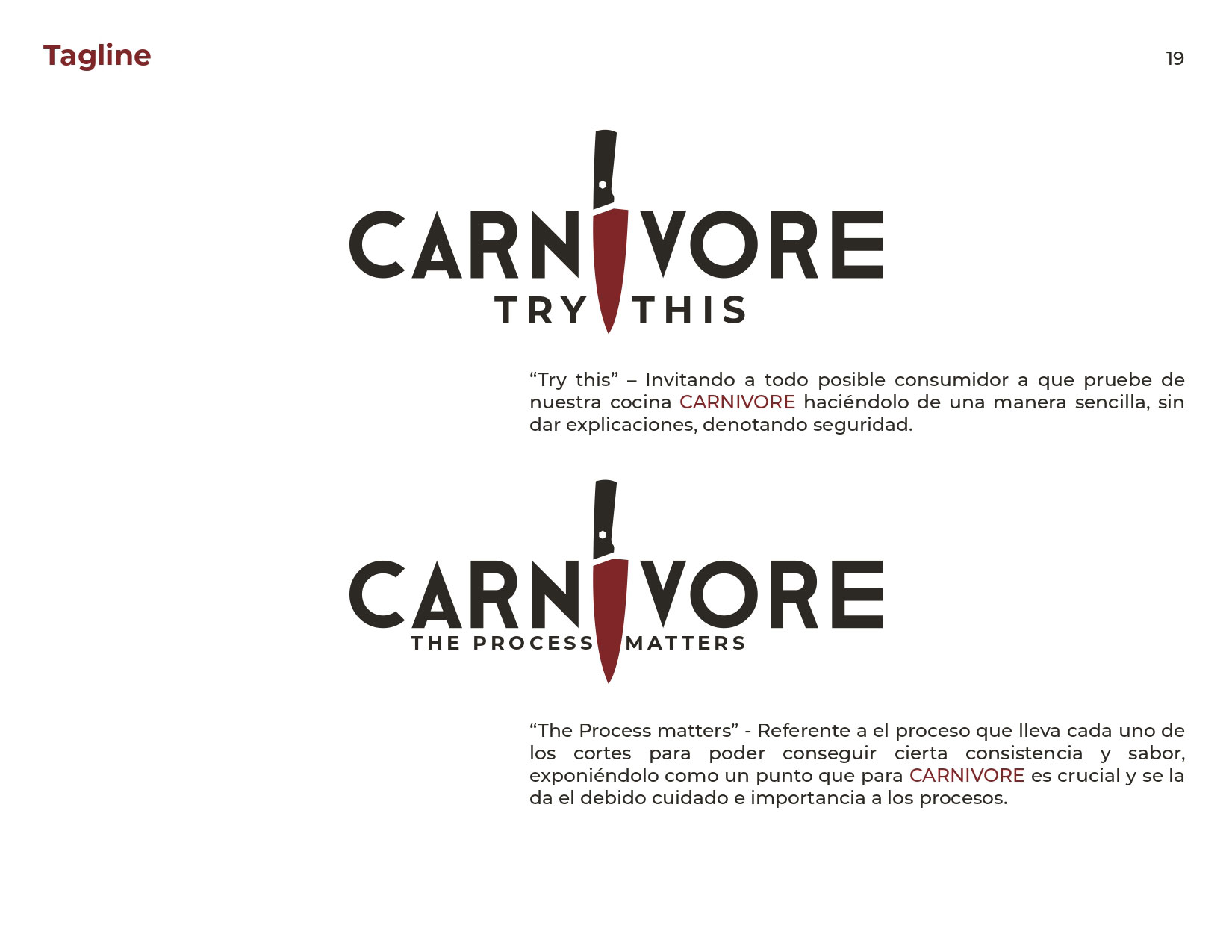
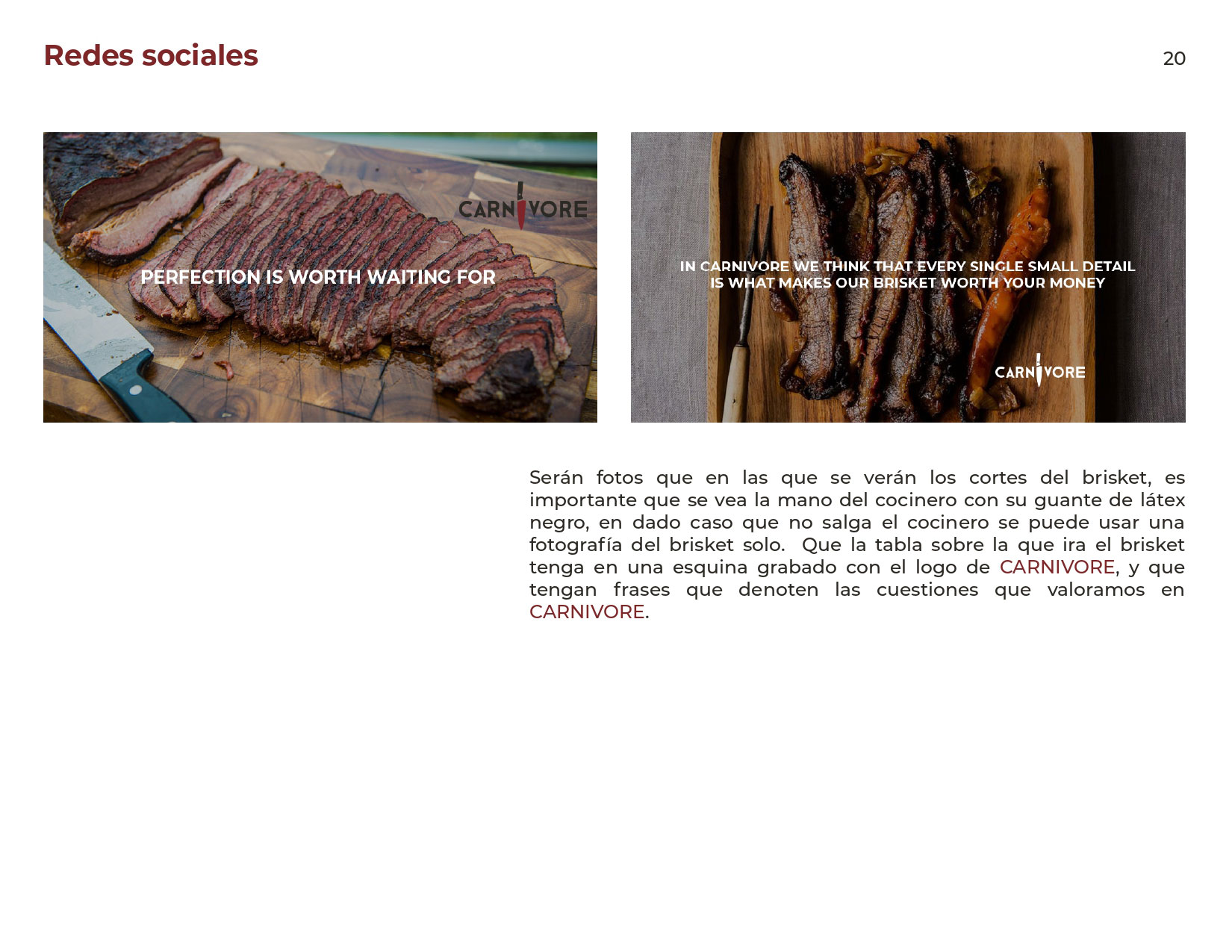
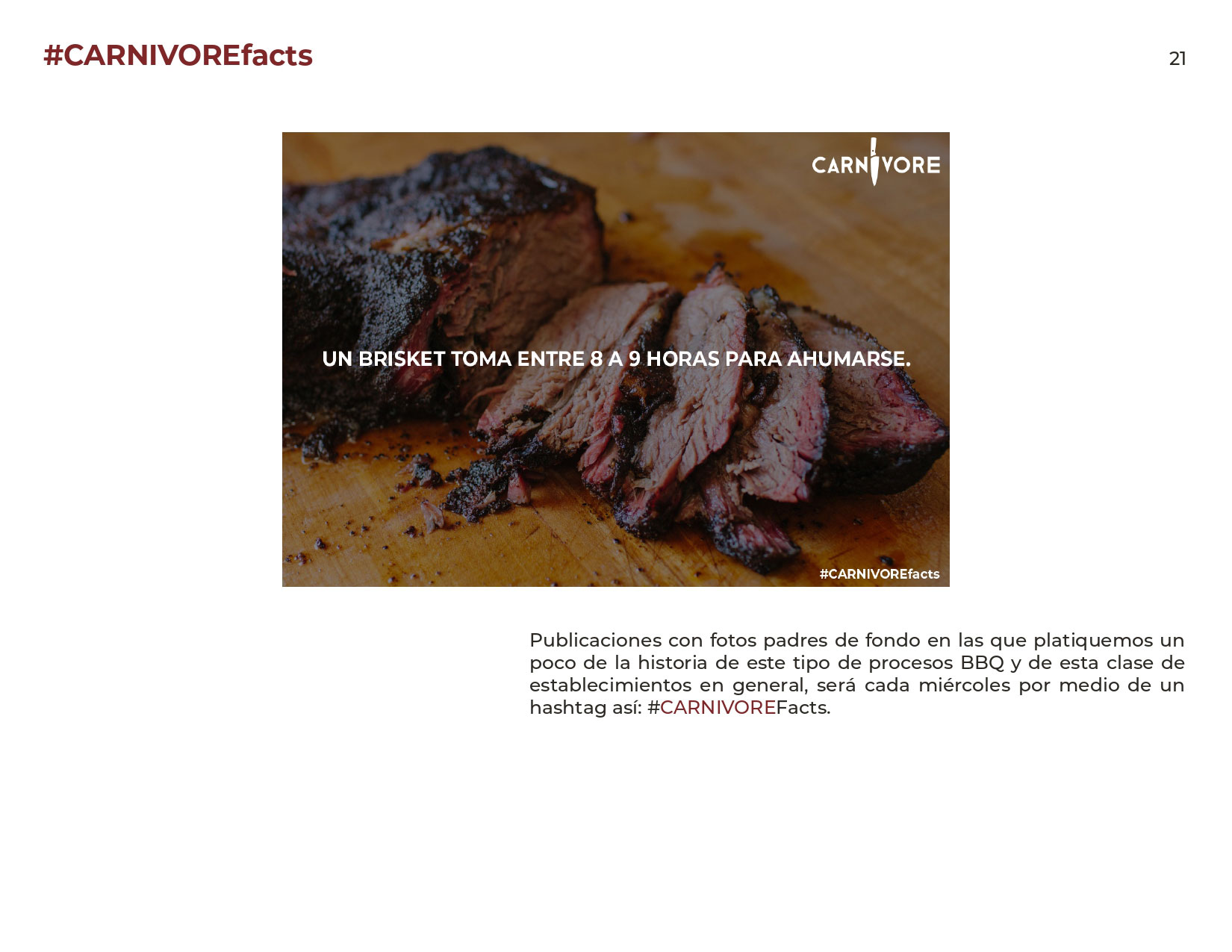
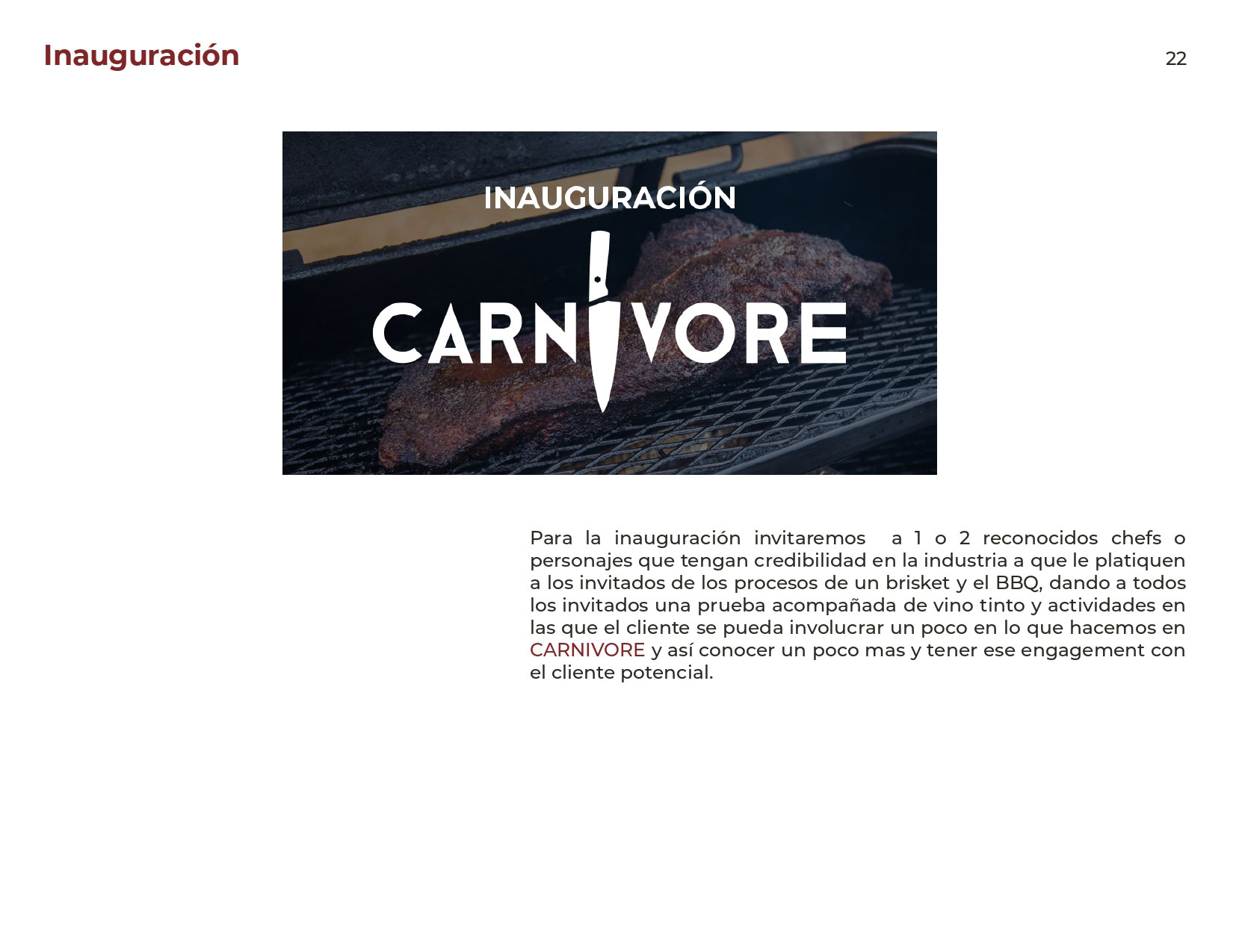
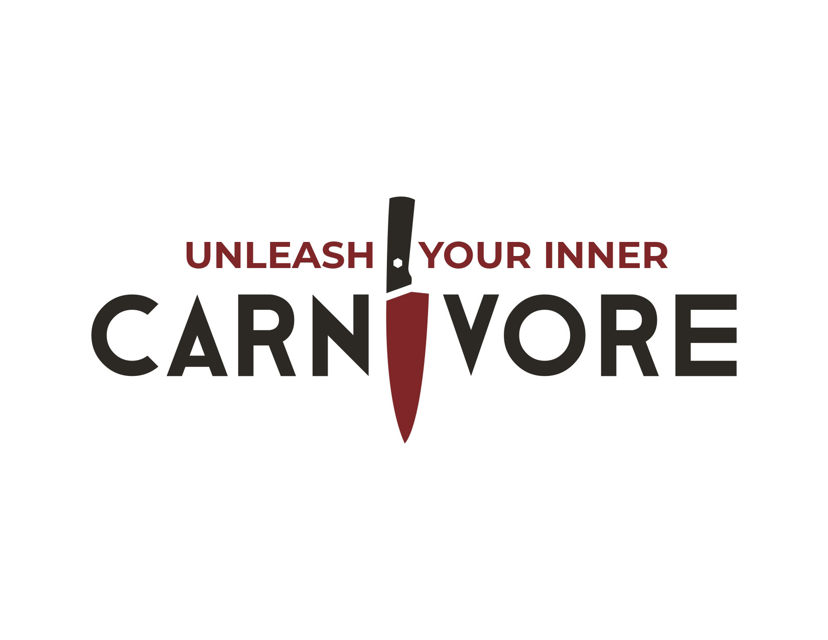
the logo design for this bbq restaurant, located in Guadalajara, Mexico, adheres to a prescribed criteria regarding brand identity mandated by the market where it is located. The criteria required that the restaurant identity be created around the existing identity of the market which only uses Helvetica in its signage. I was able to find a font that complements the established aesthetic without sacrificing originality. The most noticeable element of this logo is that the letter ‘i’ is substituted for a chef’s knife. The dark red of the knife is the only color in the design, it represents the color of the meat used in the type of bbq that is served at the restaurant. The black of the remaining letters represents both charred wood and the smoke that it releases that is vital to the cooking process of this dish.
checkout the brand book


logo and website
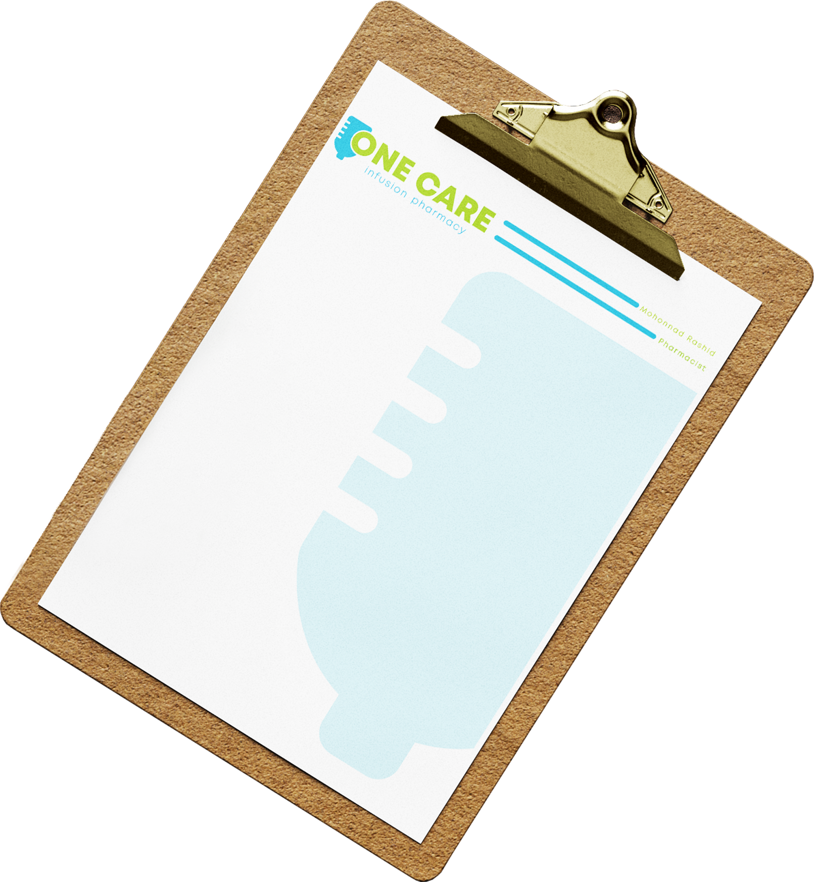
one care is an infusion pharmacy based in gallup, new mexico. i was given complete creative freedom for the design, with the only requirement being the inclusion of an IV bag in the logo. the soothing light blue of the iv bag symbolizes health and tranquility, reflecting the vital medications they provide. meanwhile, the green in "one care" represents growth and renewal. in addition to the logo, i also designed business cards and stationery for the pharmacist.


logo and bottle design

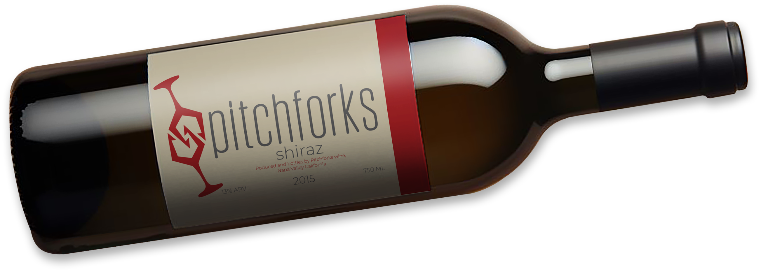
I developed the Pitchforks brand for a school project. The assignment was to create an identity and label for a red wine. I wanted to create a youthful brand to market to people of my own generation. To avoid the trappings of more traditional designs I started by working on the isotype which I created by merging together the images of a wineglass and a pitchfork. I used a red color for the isotype to represent the wine and a complementary grey for the brand name. A cream background serves to enhance the colors of the label.


logo and sign
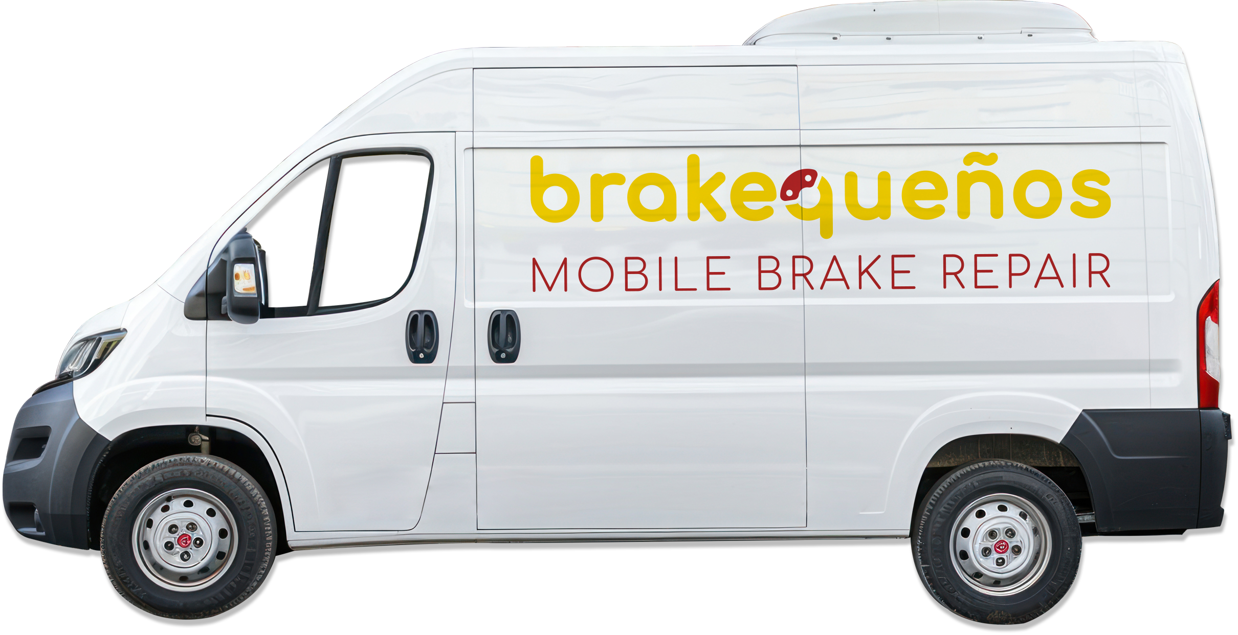
this logo was crafted for a mobile mechanic specializing in brake repair. the name "brakequenos" cleverly combines "brake" with the colloquial term for residents of albuquerque, "burqueños." the color scheme features the vibrant hues of the new mexico state flag, with a bright yellow background and a striking red zia symbol. this choice serves two key purposes: first, the colors are eye-catching and easily noticeable; second, they create an immediate connection with customers, reinforcing the brand’s local identity. at the center of the logo, the isotype merges the letter "q" with a brake caliper, symbolizing the company’s focus on brake services.
identity rebranding
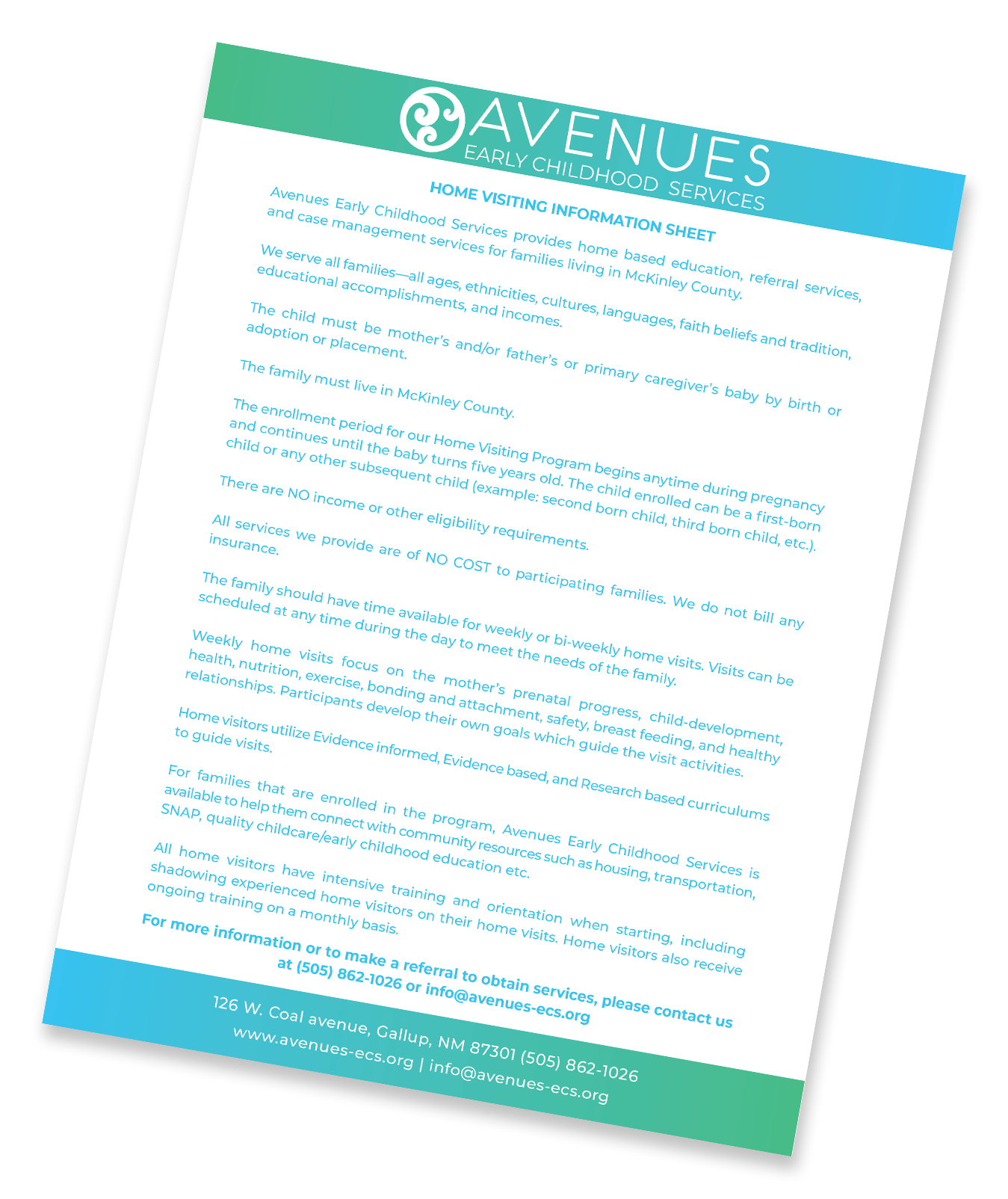
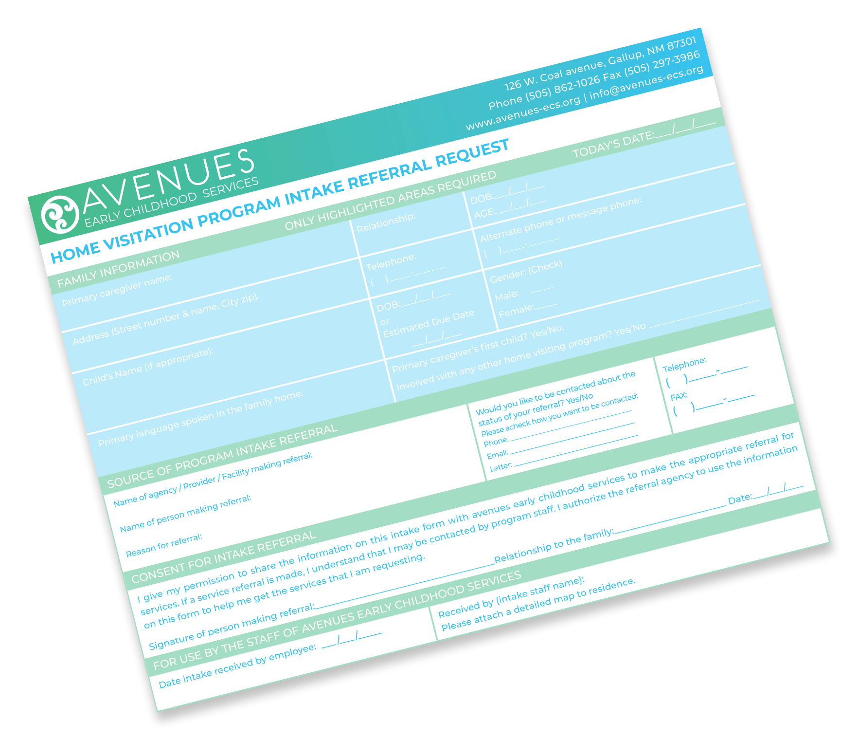
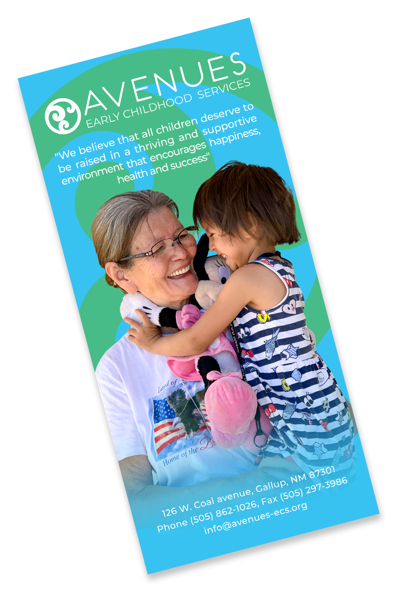
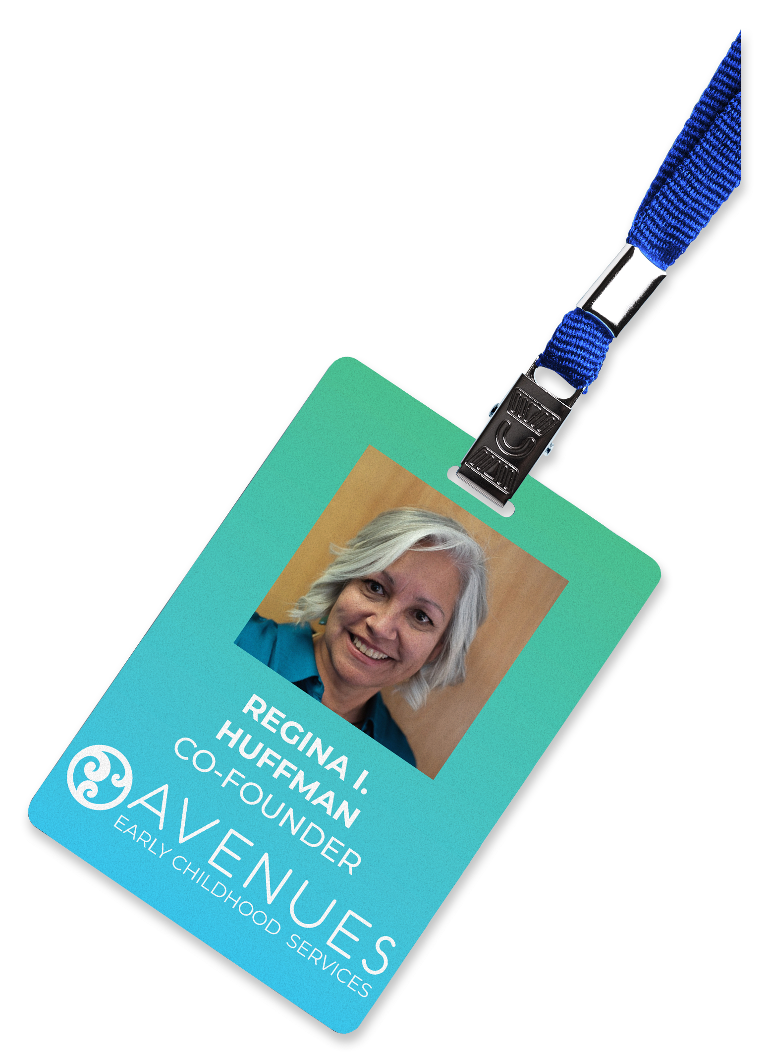
The brand redesign for Avenues Early Childhood Services, a non-profit organization based in Gallup, New Mexico, required that I incorporate existing elements into a new logo design and work within mandated parameters. I changed the color scheme from dark turquoise and black to a lighter and more soothing sky blue and green in order to evoke feelings of calm and good health. I eliminated the outer circle from the graphic element for cleaner presentation and moved it in front of the text for a more balanced and eye-catching design. Lastly, I changed the font to better represent the image the organization strives to project. The original font was bold, heavy, and aggressive, I replaced it with a thinner lightweight font which, in addition to being more legible, is more inviting and less intimidating. In addition to the logo redesign, I also updated their stationery, which included everything from a home visitation sheet to a rack card showcasing important information about the company.
logo
Alex Langston is a fiction author based out of Albuquerque, New Mexico. I designed this logo both to highlight his craft and to make reference to the author’s strong ties to the state. Langston’s authorship is shown in two different ways. The ‘A’ is designed to resemble the nib of a fountain pen and the dark grey color of ‘Langston’ represents ink. The ‘AM’ of the logo is the yellow of the New Mexico state flag to represent Langston's connection to the area.


email template design
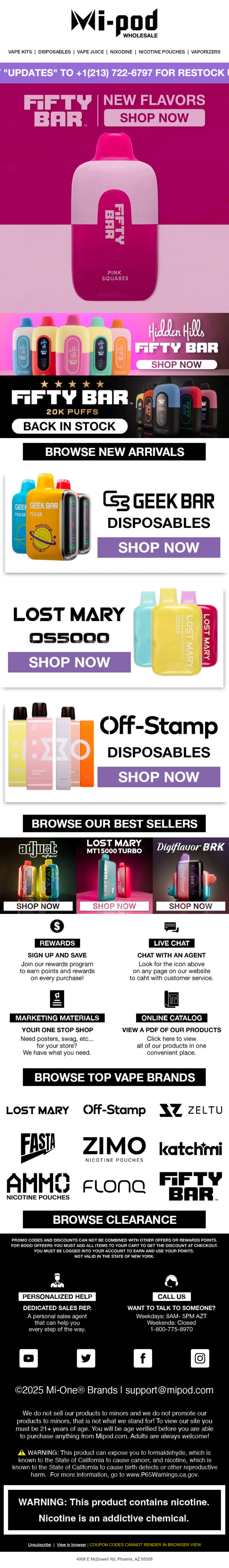
here’s an example of how the company’s emails looked before I created the modular template that’s still in use today. the person in charge wanted to feature nearly every product we sold in each email. this not only made creating banners incredibly time-consuming, but it also involved a lot of work to ensure each image linked to the correct product url. i simplified the process by developing a modular email template that’s both easy to use and drastically reduces the time spent on creation and scheduling. the template primarily relies on images to stay aligned with brand guidelines.
modular template design

the competition
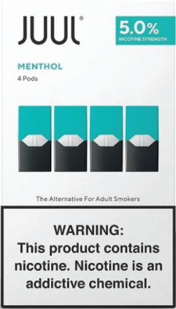
our main competitors are the juul and vuse pod systems. Juul features a minimalist packaging design that's direct and no-frills. the simplicity of the packaging gives it a clinical, almost medicinal appearance.
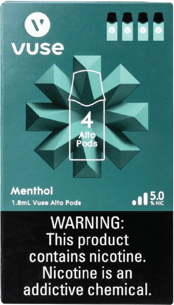
vuse, while also maintaining a straightforward design, incorporates an additional element that sets it apart. this subtle detail helps the packaging stand out from others, making it easily distinguishable in any display.
proposed design
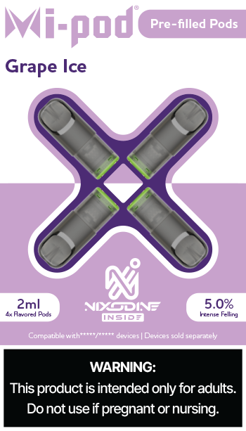
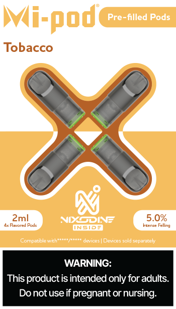
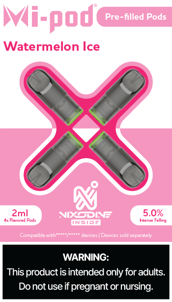
the design concept blends elements from our competitors' packaging to create something that stands out.
the top portion of the design draws inspiration from juul, featuring the mi-pod logo alongside a banner element. the bottom half, however, takes cues from vuse's design, incorporating a solid color background and using the same pod and device elements as a distinguishing feature.
to further set the design apart, the pod and device elements are framed by an alternating outline pattern, which cuts across the package. this deliberate division serves to disrupt the visual flow, drawing customers' attention to the packaging.
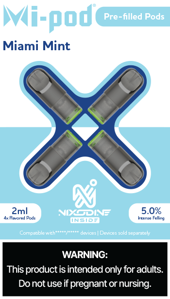
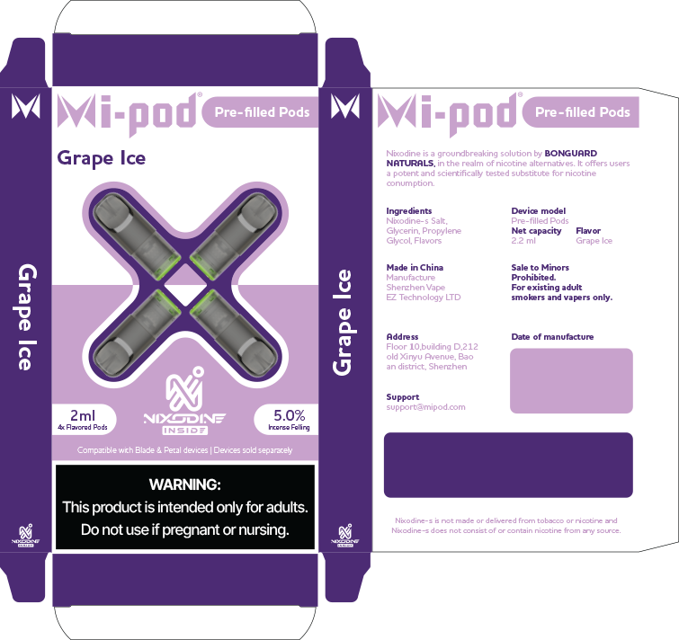
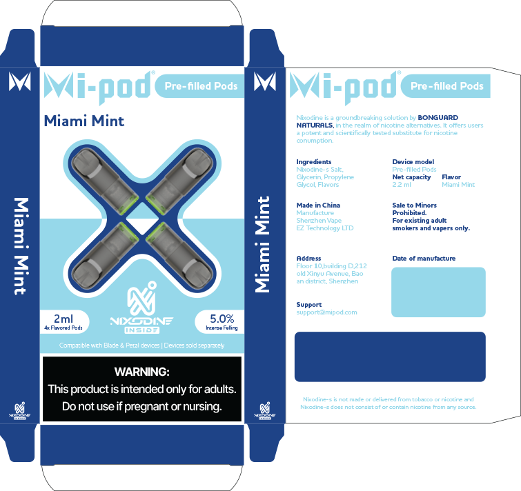
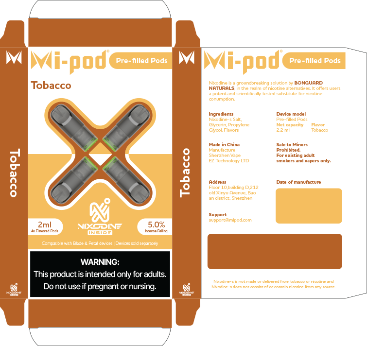
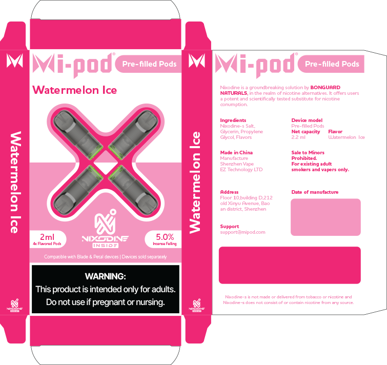
prefilled package design
both juul and vuse include four pods per package, and this design follows that same structure. each flavor is represented with two colors from a complementary palette. the use of two colors allows the darker hue to highlight key information on the packaging. the flavor name is displayed in the darker color and a larger font, ensuring it stands out clearly, even when viewed from behind the counter in convenience stores.
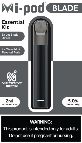
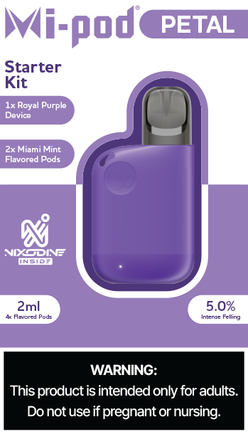
starter kit package design
the starter kit designs closely mirror the pre-filled pod packaging, featuring the same dual-tone elements to represent each device type. to accommodate the additional information about the kits, two extra banner elements have been incorporated into the design.
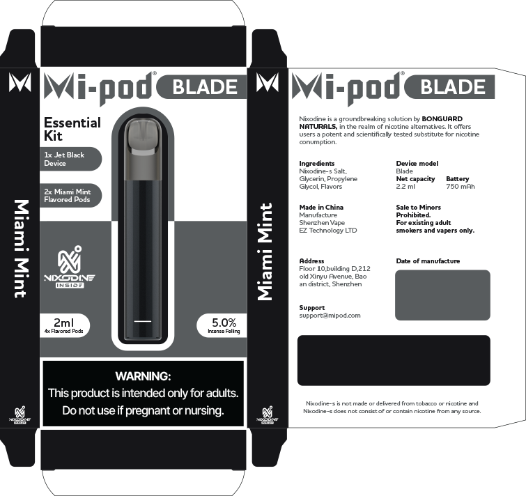
print ready files
Taking the design from a concept to something tangible includes compiling a package that comprised of the necessary files for print.

n today's digital landscape, social media is the heartbeat of a brand’s success; every piece of content shared is as vital to its image as the logo itself. with extensive experience in crafting compelling content that aligns seamlessly with brand identities, i specialize in creating strategies that adapt and evolve over time. this dynamic evolution is essential for cultivating a thriving social media presence and steering clear of brand stagnation, ensuring your brand remains vibrant and relevant in a fast-paced world.

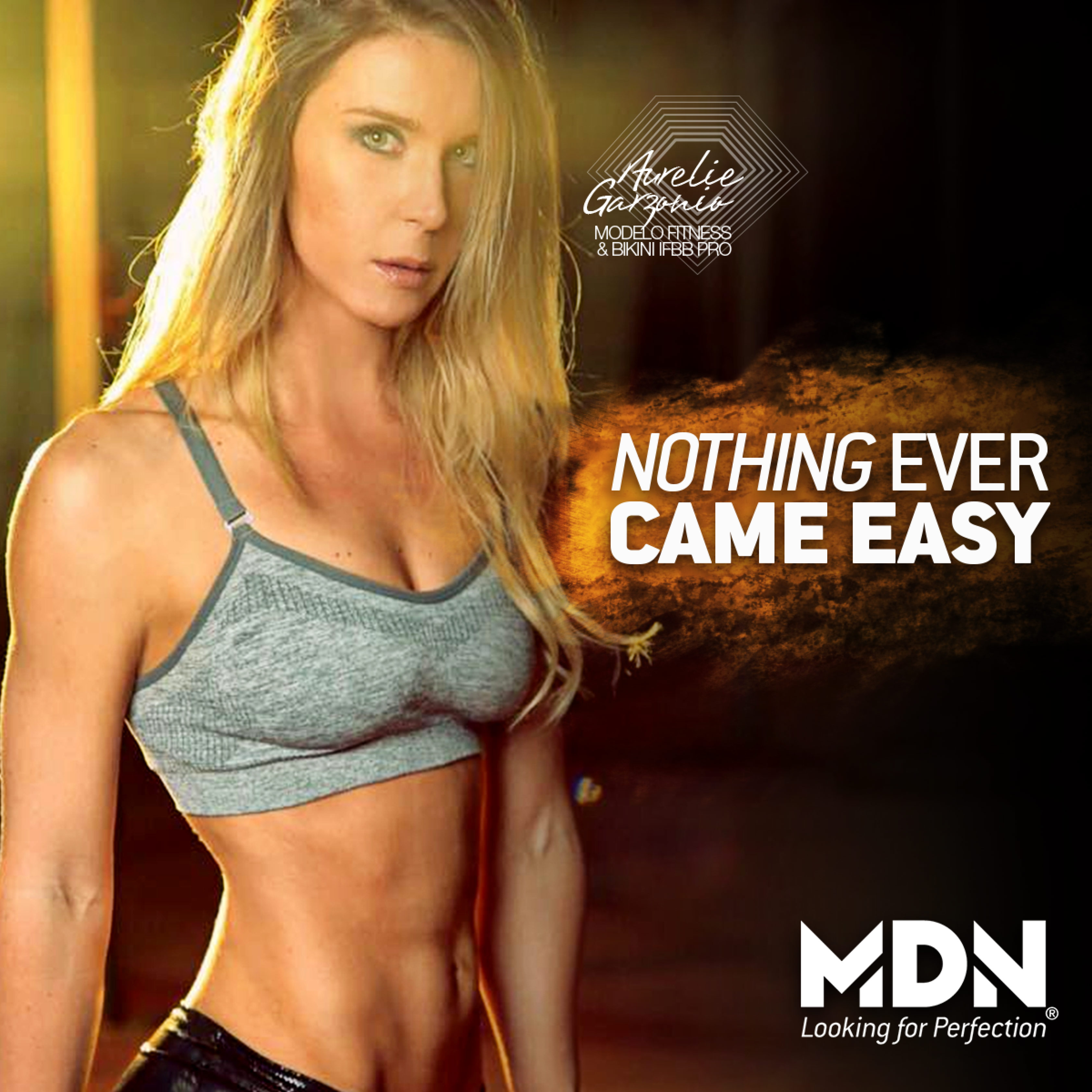

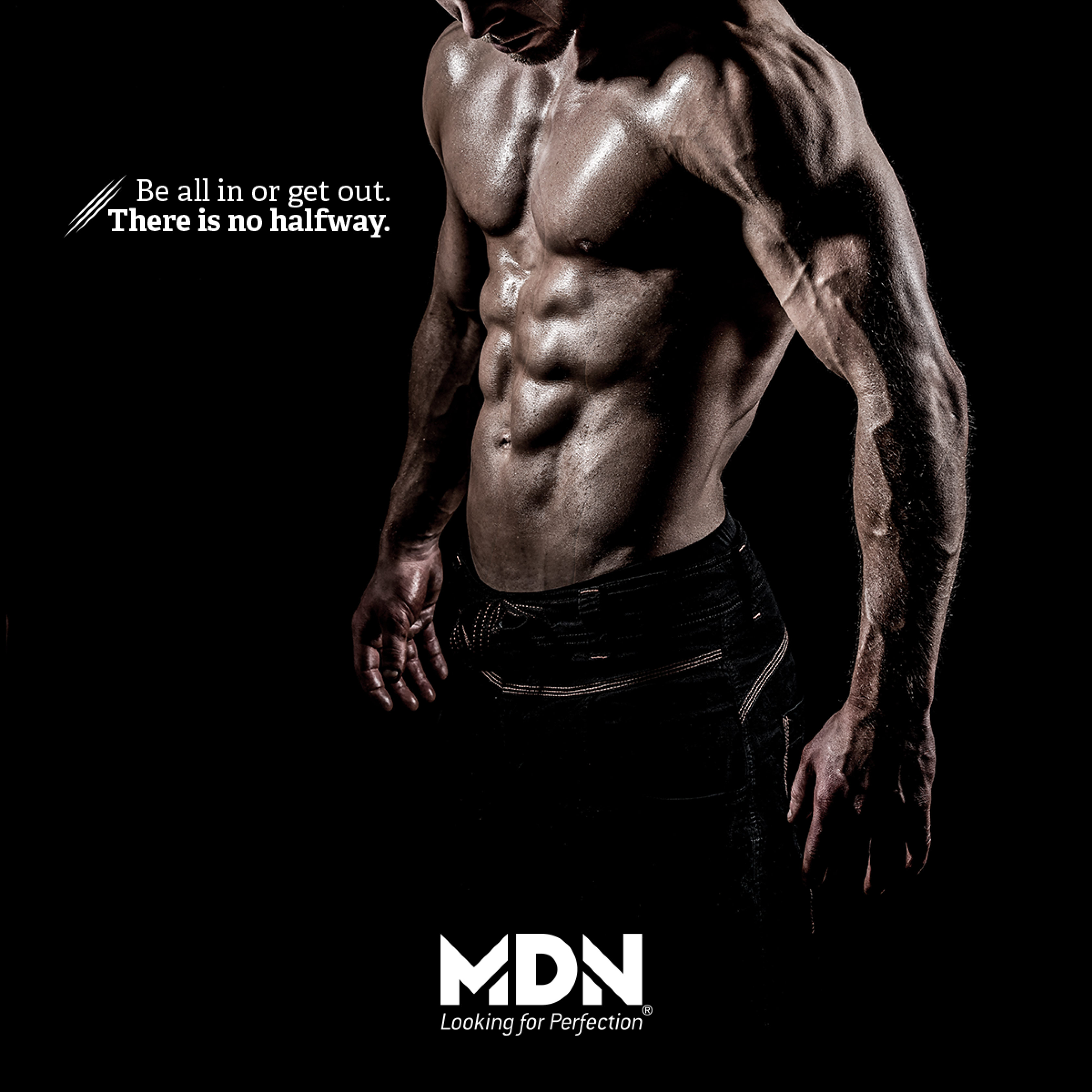
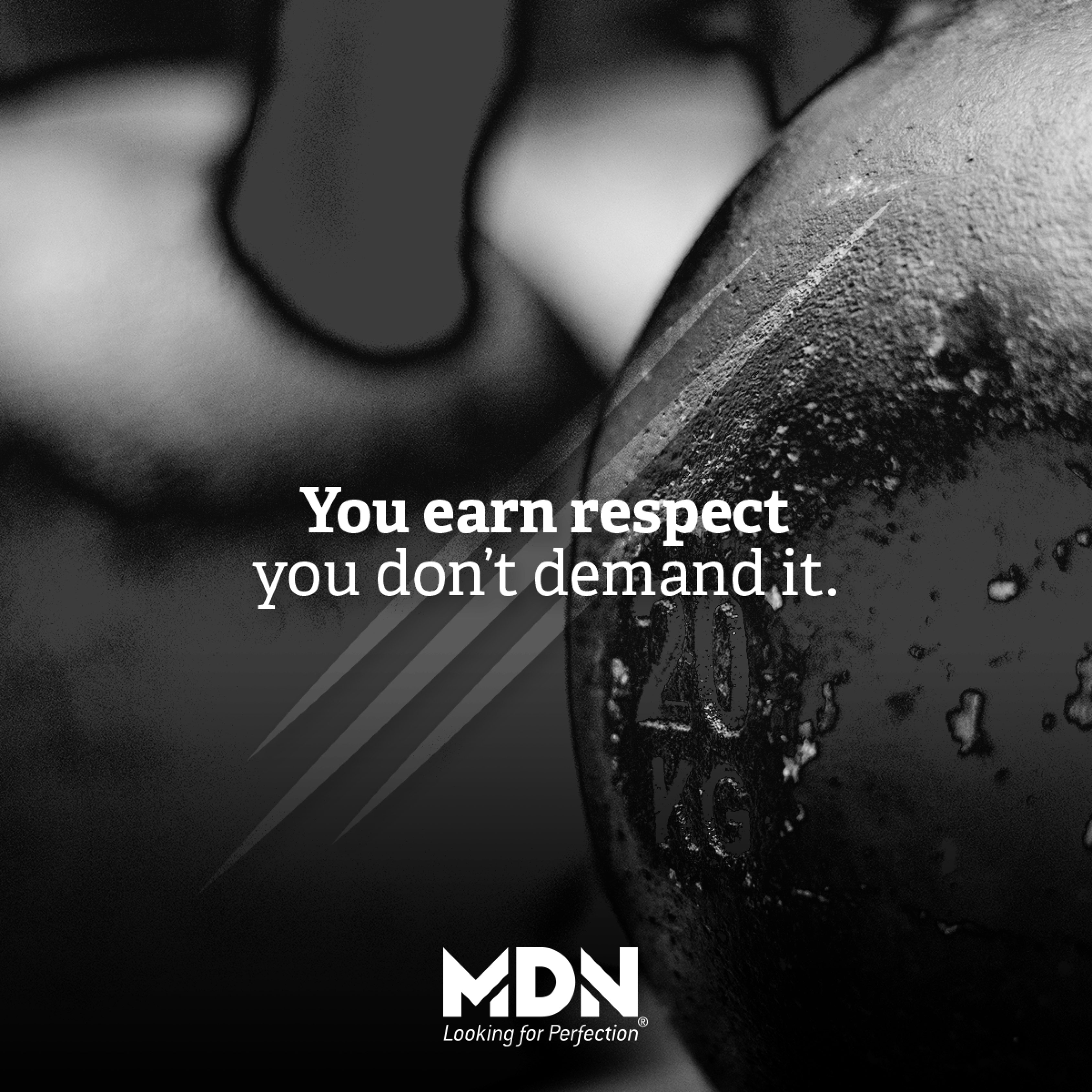
Example of a supplement brand's evolution of their Instagram posts
great design transcends aesthetics; it’s a powerful solution to a challenge, and the best answers are often elegantly simple. with my expertise in branding and social media management, i’m dedicated to elevating your brand through clean and effective strategies that resonate. together, we’ll transform your vision into impactful results. semicircle is simple solutions.